Search Panes layout not (really) responsive
Search Panes layout not (really) responsive
Hello everyone,
I have a question regarding the layout of the SearchPanes.
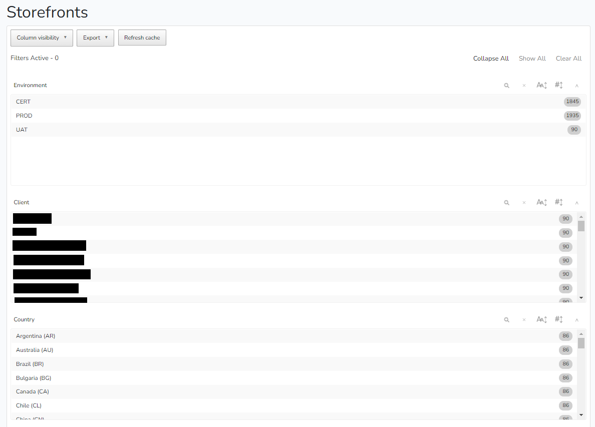
Since I boosted a lot the rendering speed by caching the content, each pane is displayed with a full width when the page is loaded, which is ugly and not friendly at all. I had no problem before when the seeding of the table was slower, but now here is how it looks:

If is resize the window even so slightly, then it's displayed correctly with responsive rows of three to four panes. I know I can force the layout with searchPanes: { layout: 'columns-x' }, but in that case I lose the responsiveness that is quite important since my number of panes can change.
Do you have any insight?
Thanks!
Answers
We're happy to take a look, but as per the forum rules, please link to a test case - a test case that replicates the issue will ensure you'll get a quick and accurate response. Information on how to create a test case (if you aren't able to link to the page you are working on) is available here.
Cheers,
Colin
Thanks for your feedback Colin! My apologies, I should have indeed specified it in my original post:
* I can't share a link since this is a local environment
* I haven't been able to replicate the issue unfortunately.
The best I can do is share my code:
If you're not able to replicate it, it's likely to be a local styling issue which we would need to see to be able to progress this,
Colin
Hello,
I had exactly the same problem.
It was because of the CSS property "transition" inherited from my ResetCSS style sheet :
* {
transition: 0.4s;
}
Removing it solved the problem.
Hope it can help.