Table responsiviness when changing div width
Table responsiviness when changing div width
 ldariva
Posts: 6Questions: 1Answers: 0
ldariva
Posts: 6Questions: 1Answers: 0
Hi,
I am playing with responsive behavior and I am getting the following problem. My applicaion is divided in two vertical sections. On the left I have a navigation tree and on the right I have the datatable. The problem is that I want to resize the width of the left section because sometime the tree became to large. I am did a simple example following the examples here.
<!DOCTYPE html>
<html>
<head>
<meta name="viewport" content="width=device-width" />
<link rel="stylesheet" type="text/css" href="https://cdnjs.cloudflare.com/ajax/libs/twitter-
bootstrap/5.3.0/css/bootstrap.min.css">
<link rel="stylesheet" type="text/css" href="https://cdn.datatables.net/2.2.2/css/dataTables.bootstrap5.css">
<link rel="stylesheet" type="text/css" href="https://cdn.datatables.net/responsive/3.0.4/css/responsive.bootstrap5.css">

<script src="https://code.jquery.com/jquery-3.7.1.js"></script>
<script src="https://cdnjs.cloudflare.com/ajax/libs/twitter-bootstrap/5.3.0/js/bootstrap.bundle.min.js"></script>
<script src="https://cdn.datatables.net/2.2.2/js/dataTables.js"></script>
<script src="https://cdn.datatables.net/2.2.2/js/dataTables.bootstrap5.js"></script>
<script src="https://cdn.datatables.net/responsive/3.0.4/js/dataTables.responsive.js"></script>
<script src="https://cdn.datatables.net/responsive/3.0.4/js/responsive.bootstrap5.js"></script>

<meta charset="UTF-8" />
<title><title></title>
</head>
<body>
<div class="row">
    <div class="col-md-6" style="overflow-y:scroll;pointer-events: auto;height: 100vh;resize: horizontal;min-width:20%;max-
       width:75%;"></div>
    <div class="col-md-6">

        <table id="example" class="table table-striped nowrap" style="width:100%">
            <thead>
                <tr>
                    <th>First name</th>
                    <th>Last name</th>
                    <th>Position</th>
                    <th>Office</th>
                    <th>Age</th>
                    <th>Start date</th>
                    <th>Salary</th>
                    <th>Extn.</th>
                    <th>E-mail</th>
                </tr>
            </thead>
            <tbody>
                <tr>
                    <td>Tiger</td>
                    <td>Nixon</td>
                    <td>System Architect</td>
                    <td>Edinburgh</td>
                    <td>61</td>
                    <td>2011-04-25</td>
                    <td>$320,800</td>
                    <td>5421</td>
                    <td>t.nixon@datatables.net</td>
                </tr>
                <tr>
                    <td>Garrett</td>
                    <td>Winters</td>
                    <td>Accountant</td>
                    <td>Tokyo</td>
                    <td>63</td>
                    <td>2011-07-25</td>
                    <td>$170,750</td>
                    <td>8422</td>
                    <td>g.winters@datatables.net</td>
                </tr>
            </tbody>
        </table>
    </div>
</div>
</body>

<script>

var table = new DataTable('#example', {
    responsive: true,
    autoWidth: false,
    scrollX: true
 });

 $(window).resize(function() {
  table.columns.adjust().draw();
 });

</script>
</html>
The problem is that when I include the follwing style in the left div.
style="overflow-y:scroll;pointer-events: auto;height: 100vh;resize: horizontal;min-width:20%;max-width:75%;"
everything seems to stop working. Even resizing the window (which works without that style in the div) stops working.
Does anyone have a clue of what is going on? ChatGPT and Copilot weren't of much help so I recorring to the ultimate resource the Natural Inteligence 
Thanks.
Answers
I took your code and started this test case:
https://live.datatables.net/peruduwo/1
I removed the event handler just to see the behavior of the
divelements. Resizing the leftdivdoesn't seem to affect the size of the rightdiv. This screenshot is after making the leftdivsmaller. You can see the rightdivstays the same size as when the page is loaded.This is why the table size doesn't change. I'm not sure, without researching, what you need to do to have the right
divdynamically adjust the size with the solution you are using. Stack Overflow might have some tips for you.You may need to use resizeObserver() instead of
$(window).resize(function() { .. });as you will want to track the size of thedivelement not thewindow. I don't think$(window).resize(function() { .. });will fire on resizing thediv. You will probably want a way to debounce the event handler because it will likely be called many times while resizing thedivso thecolumns.adjust()isn't called many times in a row.You will want to remove
scrollX: trueas it competes with Responsive to keep the table within the container.In the event handler you will want also use
responsive.recalc()like this:Feel free to update my test case if you still need help with this.
Kevin
Hi Kevin,
Thanks for answering so quickly. I tried to use the resizeObserver on left division but it didn't work.
I added the following js script to code.
Take a closer look at my test case and you will see the right
divdoesn't change sizes when adjusting theleft div. This is base don the code snippet you provided. Since the right side doesn't change change thetablesize doesn't change thus Datatables doesn't see a size change to recalculate the hidden columns. The first thing to fix is the dynamic adjustment of the right -tag divwhen the left-tag div` is adjusted.Again if you want help then please update my test case or provide a test case that replicates the issue.
Kevin
Hi Kevin. It actually does change. Just scroll down the window a bit and you'll see a handler that allows you to resize the div.
That is what I did. I scrolled to the bottom and used the handler to make the left
divsmaller. If you inspect the rightdivbefore and after it remains the same size. There is more white space but thedivthat Datatables is in remains the same. Thus thetablewidth stays the same.Before resizing:
After resizing:
The size remains the same at 540 x 666. You will need to find out how to have this
divdynamically resize.Kevin
Hi Kevin,
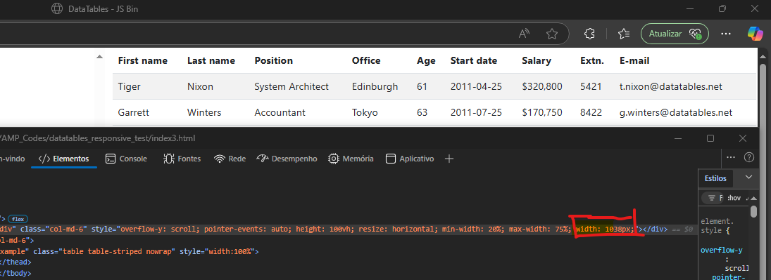
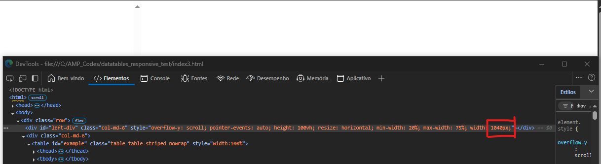
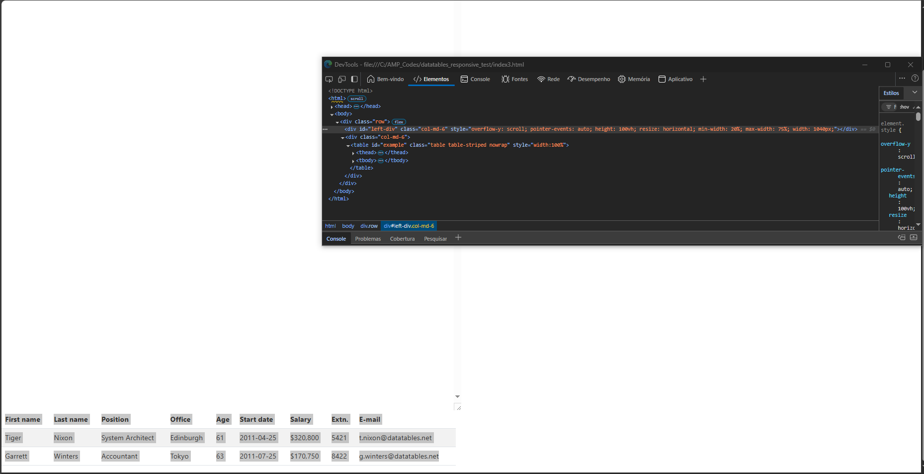
I am sorry but I am not been able to reproduce what you did. I copied your code to a local HTML file and opened it in Chrome and Edge and both show the same behavior. Take a look in the pictures I am posting. I rac reduce the size of right div up to 1038 px and it is ok. But when I increase just 2 px more the table disapear. Actually it doesn't really disapper. It is pushed down as you can see in the thrid picture.
Here it ok.
Here it desapearded
Here I found the table pushed down
One more observation. The responsive behavior works when changing the window size. For example, playing with the browser zoom. But regarding the size of the div it does not.
These issues is not due to Datatables. Sorry but I have not used the resize control before so I have no suggestions of what to do.
I believe the Bootstrap grid system is moving the
divbelow the leftdivwhen the right side is too large to fit. You will see the same behavior without Datatables.Possibly you will want to remove the grid system for resizing. See the SO thread for some options that might get you started.
Just to show this working I moved the
tableinto the leftdivand used the ResizeObserver. Also changed the height so the resize control is available.https://live.datatables.net/farodoja/1/edit
Close all the tabs of the JS BIN except
Outputand you will see how the table adjusts with thedivwidth. Once you find a resize solution that works for your environment the Datatables should work correctly in the right side.Kevin
I updated the last test case to move the table to the right
divand a new ResizeObserver for thatdiv:https://live.datatables.net/xeruwobi/1/edit
This shows that the right
divdoesn't resize when resizing the leftdiv. The ResizeObserver fires once when the the page is loaded and if the table is moved below the leftdiv.Kevin
Hi Kevin,
Yes. This is definitely something related to Bootstrap.
I tried to change the Datatable to the left div in my real app just to find out the problem happening in the navigation tree.
For while I will restrict the size of div where the Datatable is to avoid this problem.
Anyway thank youvery much for your support.