css for Editor template - multiple elements on single rows
css for Editor template - multiple elements on single rows
Sorry if this is noob css question. I'm struggling to find the best html / css to put multiple elements on a single row in the Editor form for two situations:
- want distance and units on same line with no label for the units, e.g., Distance [ textbox ] [km, M select]
- want link on same line, e.g., Client [ textbox ] editlink
I'm using an Editor template so I have more control over the display. Also note I'm using jquery ui if that makes any difference.
http://live.datatables.net/vekapazu/2/ has some of the stuff I was trying. This example is without jquery ui, and with button instead of link.
This question has accepted answers - jump to:
This discussion has been closed.
Answers
The key thing to remember here is that Editor will insert the fields with the same DOM structure that it uses in its own lightbox (e.g. label, input, error, message, etc) - but you can control where those field containers go.
So it isn't possible to use a template to insert a new element into a field container. For that you have two options:
field().input()to get a reference to the input element and then inserting any extra DOM elements next to it (using a little jQuery or DOM methods).Allan
For item 1, I have distance and units as two separate fields now. This is why I was thinking I could do something like wrapping the two fields, and within the wrap make some css mods to your container. I can configure the second field to not have a label, or use css to not display it but don't know how to put it on the same row with nice aesthetics.
Are you saying to make it one combined field with two input elements, and handle the two real fields on the server for storage in the database as two fields? That sounds more complicated but I guess if the css solution won't work I would have to try that.
I am doing similar form layouts and I found that using my own customer templates gives me the best option for laying out the fields how I want them.
The template example that I base mine off of is here.
https://editor.datatables.net/examples/simple/template-attribute.html
I combine that with the builtin input styling found here.
https://editor.datatables.net/examples/styling/fieldDisplay.html
The multi column styling here
https://editor.datatables.net/examples/styling/columns.html
and some minor css adjustments to hide the labels for inline inputs on same row. and wrap them up in flex rows to control input field width.
sample html for form.
and main CSS for flex:
My CSS is a mess because its still WIP, once I have it more polished I plan on going back and scrubbing my css and wrapping up related css into classes where I can, or else Id show you more, but if you need help let me know.
My form layout.
Zoomed in.
@sinfuljosh - Nice examples of template layout. Thanks for sharing that with us!
@louking
Sort of. You could have two input elements (or one input, one select) in a single field. The
setmethod of the field would split the value into the numeric and value parts. Thegetmethod would combine the values from the two inputs.So from the outside world it appears as a single field, but visually it is split for the end user into value and unit.
Allan
Thanks, all. I will be experimenting based on @sinfuljosh and @allan 's responses.
@louking


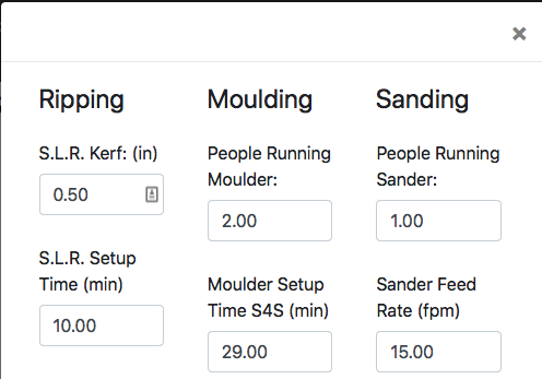
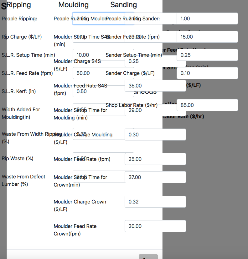
Thanks for the examples above, I am trying to get a custom form split into 3 columns and have been able to do this, however the width is quite narrow. Whenever I expand elements such as the entry field or labels for formatting it appears that the
div.modal-dialog {element does not auto expand correctly. While I can force this element to the desired width it occurs site wide. Have you encountered this since your post above?Sorry for the late reply. No I haven't seen what you're seeing. I suggest making a new question for Allan, with a jsbin example of the problem.
if you can post an example of your current layout to http://live.datatables.net/ ill see what i can do to help.
here is an example of how you can use flex to get multiple columns with decent spacing.
http://live.datatables.net/koberaru/1/edit