How do I prevent form error messages from causing editor buttons from being moved below the form?
How do I prevent form error messages from causing editor buttons from being moved below the form?
In addition to field level errors displaying below each field in the default editor template I also display a form level error message which displays by default at the bottom of the editor form. The issue I am having is when the message exceeds a certain length it is causing the form buttons to be shifted below the bottom of the editor.
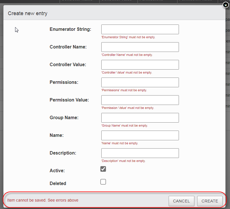
if the message is short the form looks like as expected:

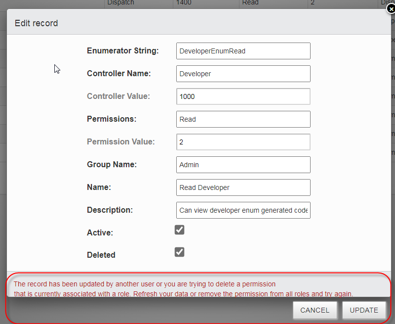
If the message is longer the form buttons are pushed down below the bottom of the form like this:

The code I am using in the controller that returns the error message is below where I set the value of Error with whatever error I want to display.
    response = new DataResponse<TModel>
    {
        Data = rowData,
        Error = errs.Any() ? "Item cannot be saved. See errors above" : "",
        FieldErrors = errs
    };

    ...

    return Json(response);
Where DataResponse and IDataResponse) code is:
    public class DataResponse<T> : IDataResponse<T>
        where T : BaseModel, new()
    {
        public DataResponse()
        {
            FieldErrors = new List<FieldError>();
        }

        public List<T> Data { get; set; }
        public string Error { get; set; }
        public List<FieldError> FieldErrors { get; set; }
    }

    interface IDataResponse<T>
        where T : BaseModel, new()
    {
        List<T> Data { get; set; }
        string Error { get; set; }
        List<FieldError> FieldErrors { get; set; }
    }
How do I prevent longer form level error message from causing the form buttons from being pushed off the bottom of the form? I would make a custom template but there is not documentation on how to configure the are where buttons are displayed. Everything else uses as expected...
Any help is greatly appreciated
Answers
You could add:
to your CSS.
That will keep it on a single line, but your user wouldn't see the whole thing!
The problem with allowing it flexi height is that a number of other parts of the CSS assume a fixed height footer (to allow for the scrolling of the form body without moving the footer).
Beyond that, I'll need to have a bit of a think about it I'm afraid...
Allan
Hi Allan,
This is what I have come up with for CSS as a temporary solution. It works, though not ideal.
Override CSS:
Where the padding-bottom: 40px causes the Form_Content area to resize to compensate for the increased Footer height being set to 80px.
The results is an enlarged footer area that looks like this:
This can accommodate larger, but not too long, errors like this:
A better solution would be great as these types of errors/warnings need to be displayed to the user and they are not field based errors. So having this lower footer message area is an ideal location to display them.
RobO
I've filed an issue on our internal tracker (DD-1344) so this doesn't get lost and I'll look at it for the next release.
Regards,
Allan
Just to say that this will be fixed in 1.9.3. I've moved the form error message into the form body, rather than the footer - as it wouldn't have been possible without a major restructure to multi-line the footer. That will likely happen in future, but not for the patch release.
Allan