How do I "shrink" the table to fit mobile better
How do I "shrink" the table to fit mobile better
 shill99
Posts: 1Questions: 1Answers: 0
shill99
Posts: 1Questions: 1Answers: 0
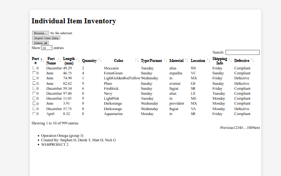
Please see first attached image. I am using Laravel framework for front end and back end. The only css on the page is the datatables.net css and js.
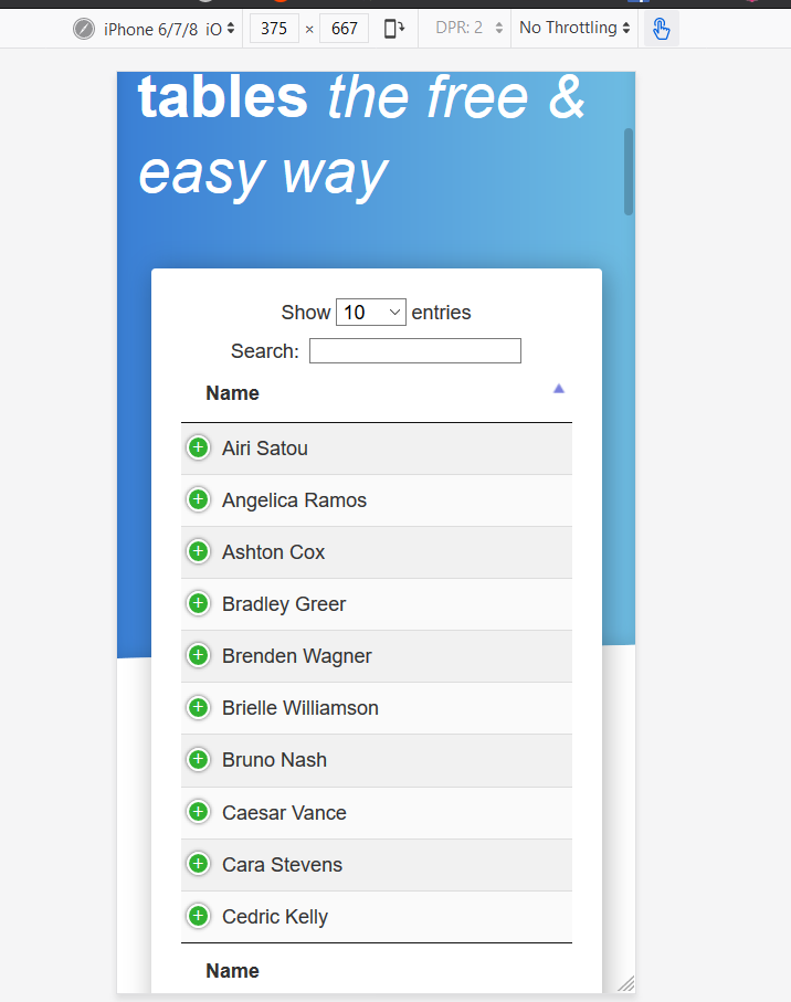
How do I fix the table to only show 3 or 4 columns and have the rest "on-click" like the datatables example on the datatables.net main page (see second image)
My project can be viewed at https://omega.scweb.ca/omegainventory/
This discussion has been closed.
Answers
Your page isn't loading, but you need to use Responsive to get that it's the screenshot.
Colin