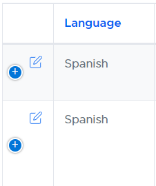
How to align datafeather vertically with the blue plus sign.
How to align datafeather vertically with the blue plus sign.
Below is the code I have to display a datafeather in the first column so I can have an edit feather for every row. However, it doesn't seem to do the alignment correctly. There is no other css being applied to this outside of bootstrap and datatables css files that are used. Any suggestions?
columns: [
{
data: "Demand.AppointmentSourceID",
render: function () {
return "
";
},
width: "1px"
},


Answers
We're happy to take a look, but as per the forum rules, please link to a test case - a test case that replicates the issue will ensure you'll get a quick and accurate response. Information on how to create a test case (if you aren't able to link to the page you are working on) is available here.
Cheers,
Colin
I understand the rules but was hoping I could at least get suggestions. To get a working example into one of those things would probably just take too much effort and I just don't have the time for that. So I guess if this isn't allowed then we could close it if no one has any ideas how to align a feather in the same column as the blue plus thing.
It looks like you are using Bootstrap4 along with Responsive. Maybe you can start with this example:
http://live.datatables.net/nuwenoko/1/edit
Add your datafeather then we'll have something to work with to see if we can help. Otherwise we will be guessing what you have.
Kevin