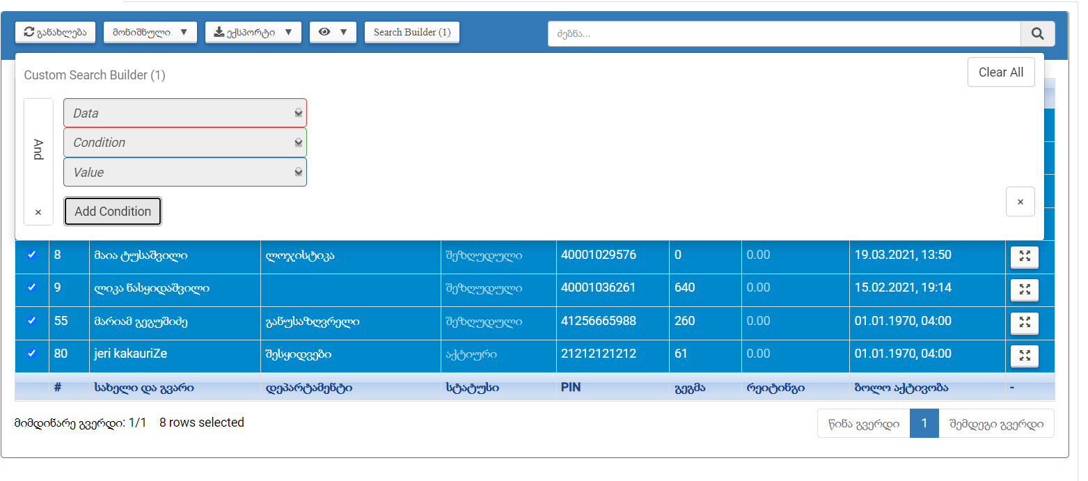
SearchBuilder Configuration with Buttons - Inputs Layout
SearchBuilder Configuration with Buttons - Inputs Layout
Hello,
I am using the SearchBuilder Configuration with Buttons for Bootstrap 3.
However, the input fields don't seem to be horizontally aligned (see the screenshot below). Also, the custom button triggering the Searchbuilder which initially has the icon instead of the text Search Builder, removes the icon and writes Search Builder after clicking it.

Any workaround?
I tried to edit the Searchbuilder js file and change the form-control with a custom class, but then I am getting a Maximum call stack size exceeded error.
Thanks
Answers
Something doesn't seem correct with the styling of your page. For example the down arrows on the right side of the select options, ie, to the right of Data, Condition and Value, have an extra image.Take a look at the Standard BS 3 example.
Make sure you have all the correct CSS and JS files for Bootstrap 3. Use the Download Builder for this.
If you still need help please post a link to your page or a test case replicating the styling issues so we can help debug.
https://datatables.net/manual/tech-notes/10#How-to-provide-a-test-case
Kevin
Hi, @kthorngren
Thank you very much for your reply.
The extra image comes from my custom CSS class. I have removed the custom styling. Please have a look at the screenshot.
What I am wondering is whether the select options must be vertically aligned? They would be looking better if aligned horizontally. Won't they?
As for the example, you've provided, this is not a SearchBuilder Configuration with Button. The alignment problem appears when the SearchBuilder is accessed from the button.
Is there any such example available for Bootstrap 3?
Thanks again!
Here is an example of BS3 with the Search Builder button. The inputs are horizontal.
http://live.datatables.net/favuvime/1
Kevin
@kthorngren
I have found my mistake.
I was not using dom: 'Bfrtip'
Adding dom: 'Bfrtip' has fixed everything.
However,
dom: 'Bfrtip' makes the position of buttons in Bootstrap 3 DataTables very much messy.
Without dom: 'Bfrtip', the SearchBuilder inputs are again vertical.
Should I make a test case to debug?
Thanks
@kthorngren
Please,
Have a look at the test case https://jsfiddle.net/qrp83xfc/1/
Thank you
When you use
$('.row:eq(0)').appendTo('.panel-heading');the Search Builder ofrm seems to lose this CSS:This is from
form.less.Which is causing the select inputs to be stacked. I'm not sure why this happens. Maybe @allan can provide a solution.
Kevin
How about this alternative?
"dom": '<"panel panel-primary"<"panel-heading"<"row"<"col-sm-6"B><"col-sm-6"f>>>t <"panel-footer"<"row"<"col-sm-6"i><"col-sm-6"p>>>>'
Would it cause any error?
Did you try it? Does it work properly?
Kevin
Hi, @kthorngren
It seems to be working properly.
The only thing that needs to be fixed is that the processing is not displayed in the middle of the table. I don't know how to fix it, though.