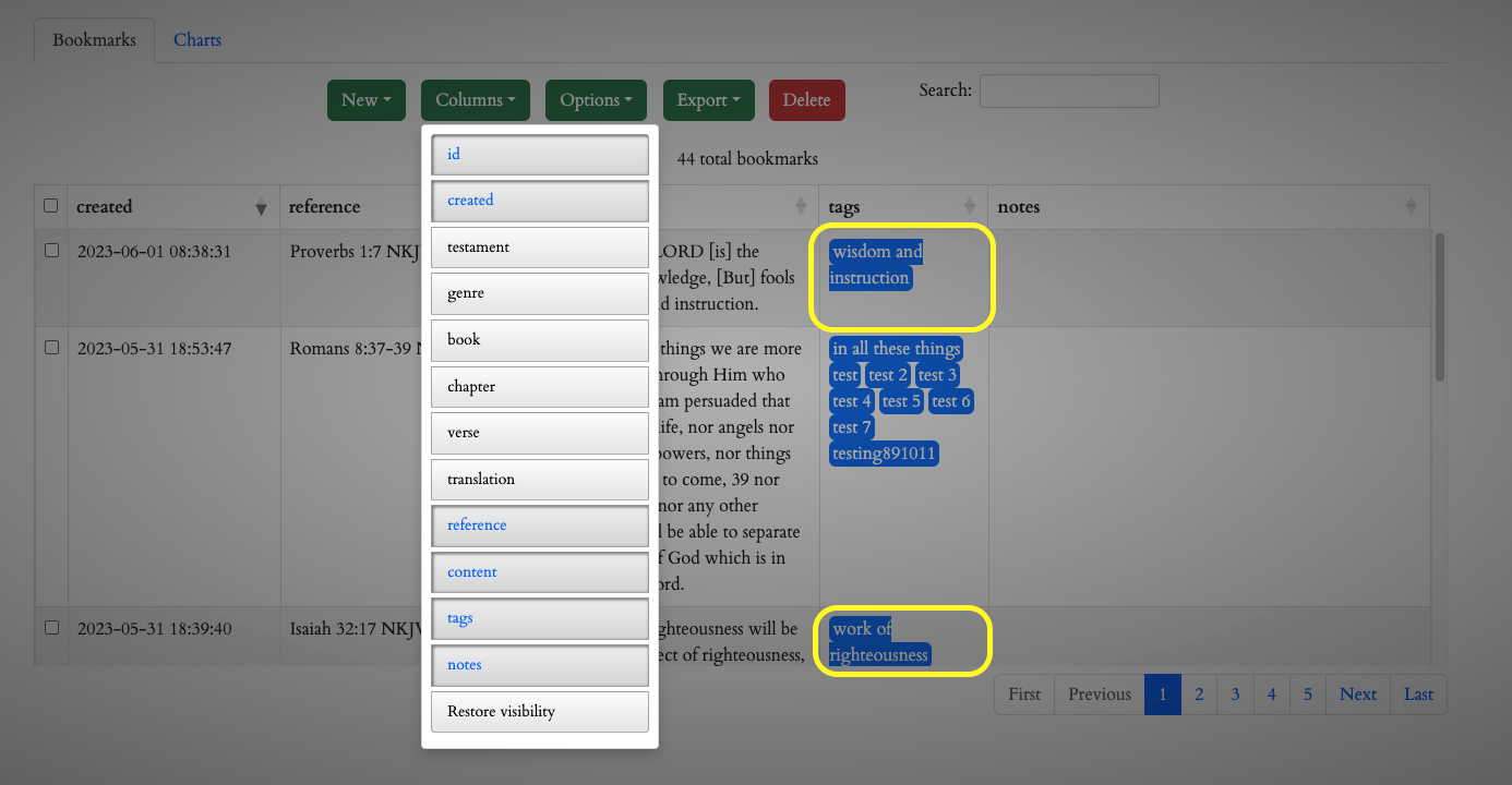
What is the best way to set these columns so that the styling looks correct?
What is the best way to set these columns so that the styling looks correct?
Hello all,
What might be the best way to set these columns so that the styling looks correct? I have a lot of columns, so when I am toggling on all the columns, this can be definitely problematic, the picture with the 2 yellow outlines shows what I am talking about. "wisdom and instruction" is one "tag" so to speak, if I tagged it as "wisdom", "and", "instruction" that doesn't seem to be a problem as you can see with my test 1 2 3 tags. Thanks for any input on this.

This discussion has been closed.
Answers
Sorry I'm not understanding what styling you are looking for. Please provide simple test case with an example of what you have and tell use what changes you need.
https://datatables.net/manual/tech-notes/10#How-to-provide-a-test-case
Kevin
If your table is responsive you need to make sure that no line break is done and the column is automtically made wider.
In this code I want one line fore each combination of category_name and value. I just use white-space:nowrap. You could also use non breaking spaces but for my purposes the following solution was easier:
This one is a little more sophisticated. In this case I want the column to be at least 40 characters wide if "ctr_name" is longer than 40 chars. Hence I replace white space with nbs in the first 40 chars substring and call it "namePartlyNBS"
I am not sure whether I understood your question correctly. I was just guessing. So Kevin's question is absolutely legitimate