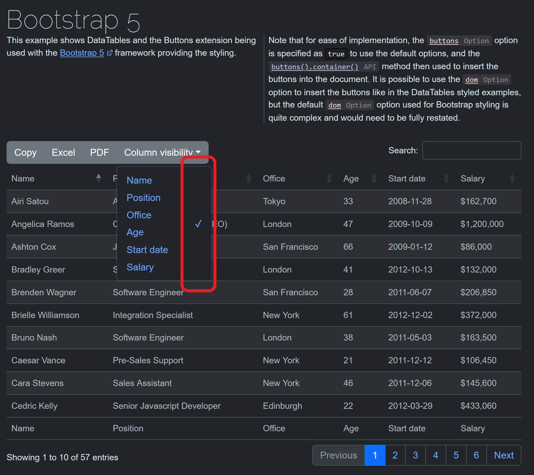
colvis button dropdown with Bootstrap 5 seems to have an issue
colvis button dropdown with Bootstrap 5 seems to have an issue
Description of problem:
I'm planning on using colvis for my project and was looking for examples of using the colvis button with Bootstrap 5 when I came across this example here: https://datatables.net/extensions/buttons/examples/styling/bootstrap5.html
But it seems that the check mark is not rendered well in this example as shown by the attached image.

Compare that with another example without Bootstrap 5 here: https://datatables.net/extensions/fixedcolumns/examples/initialisation/colvis.html

Unlike the first image, the other colvis has check marks for each column name. Is this intentional or a possible issue? And how do I fix this so that there is check mark for every column name when using Bootstrap 5? Thanks!
This question has an accepted answers - jump to answer
Answers
100% a bug - sorry I missed that one!
The workaround is to add:
to your CSS.
I've committed a fix (Bootstrap 4 had the same issue) and will do a release tomorrow with the change.
What do you think of the new dark mode?
Allan
Thank you for this, allan!
The dark mode looks awesome!